Showing posts with label illustration. Show all posts

Sunday, October 21, 2012

Latest Transmissions

Seeing as the weather was so utterly dismal this week-end, I spent the better part of it sketching and coloring up a visual interpretation of those weird forms I posted last week. I'd do all the Lemurian alphabet in this style if I had enough patience but I don't so 3 or 4 are probably enough for now. Here's one..


I'm quite happy with this particular illustration because of various reasons - 
1) it actually looks and feels like an illustration. I always thought that my stuff was more fine art-y, graphic design-y or graffiti-y rather than illustration (which actually is what I studied after graphic design).
2) it's personally a gathering of loose ends of sorts - visually, topically, methodically..
3) I graduated from BA (Hons) Illustration feeling as if I had a significant amount of unfinished business to attend to stylistically. My final project was a stylistic hodge-podge and looked a mess as I'd used three different printing processes to create a concertina when I could and should have used just one. As crazy as it sounds, I could not for the life of me find a line, a technique, a method or something that felt mine. That left me in a bit of a panic and feeling as if I had just wasted a precious three years which seemed especially true upon comparing my work with the very accomplished work of some of my classmates'. It's taken me an additional one and a half years of additional visual exploration to start feeling as if I'm getting somewhere.

Anyway, onwards and forwards..

Tuesday, September 25, 2012

Nieuw Werk / Wolken

Holy flying mackerel, that took a while! Settling in was far from speedy, but I've started doing some new work during these past few days now that the dust's settled a bit. The first few bits of drawing seem to be concerned mostly with clouds and wishy washy fluffy stuff. That might be due to the sky being a bit more visible out here in London's Zone 3 (as opposed to Zone 1)? I don't know. I like them though and I might do a little something with them this week. And while we're at it, I've thrown in a track by Shlohmo that reminds me of the white stuff. 


Sunday, July 1, 2012

Work for sale at Patches Market, Malta

Next Sunday the 8th of July will see yet another installment of the now firmly established Patches - Malta's handmade product market (which is, by the way, run by my camera hugging/brush wielding sister Denise Scicluna). This will be I believe the 11th edition yet, and as much as I've always wanted to take part I've never really had much of anything to sell really. Up until now that is. 

So, this time round I'll be having a stall at the market. I will be selling some prints and books of mine but the exciting bit for me is that I will also be selling works by other Maltese (or related) graphic artists. These include - Ken Borg, Thomas Cuschieri, Adrian Gauci and Sara de la Mora. We'll be selling a variety of graphic goodies ranging from prints (riso and screen), artist and comic books, postcards, accessories etc, most of which I believe is going to have been available in Malta for the first time.

For my part, I will be having 3 or 4 new risoprints, a selection of postcards and copies of my book The Birth of Culture up for sale (see pics below). If you're not in Malta at the time then of course do please get in touch if interested in copies of the prints or the book, but for you graphic and illustration enthusiasts who will be in Malta at the time - we expect to see you there!


Monday, April 16, 2012

B-Cards

Last year while at uni I did a series of screenprinted business cards for my fledgling little freelance business. I thought I wouldn't have another chance to screenprint some business cards for free for some time, so with that in mind and blind drunk on dreams of instant freelance illustration success I printed ALOT of them. 

Unfortunately I still have most of them. 

Of course I blame these economically hard times but hey, have a look. You might like them and call me up for a job?


Monday, March 19, 2012

The Birth of Culture - a handmade book


This weekend I finally got round to producing and finishing the first few copies of a tiny book I'm calling The Birth of Culture. This book is really the first step in an attempt to inject anthropology with illustration - two disparate fields which I think have much to offer yet rarely cross each other's paths (I'll be posting more on 'anthropological illustration' sometime in the next couple of weeks).


The Birth of Culture then is a book about culture in its most generic definition - a mold of some sort that shapes the lives of a group of people through a series of habits, norms and beliefs. The theme here is not just 'birth' but also this constant motion that over time can be seen as a pattern or a cycle through which cultures pass. The various stages of this cycle are represented as different chapters starting from the conception of a culture (as influenced by its geographical environment), evolution over time, cross-cultural exchange etc. I found that the easiest way of representing all this was by using symbols, or visual languages (scripts). Language (verbal and written) can often give a good idea of what a culture is all about, and I've used different invented scripts to demonstrate the myriad different ways which cultures can find themselves evolving into. It is this precisely these impossibly different ways in which human culture manifests itself and learning about what causes them to become this way which I find so compelling in anthropology.


The idea for the book's subject came over time from reading old historians and travellers like Ibn Battutah and Herodotus. As I had remarked in another blog post, it had kind of dawned on me that cultures are in constant motion and that a culture may disappear but it never really dies. As anthropologists around the world are more than aware of, the globalized nature of today's world means that cultures (especially minority ones) have never had existing so hard. On the other hand, international human migration is probably at one of its highest levels ever and while this might be endlessly fascinating to witness from an anthropological point of view, it is also - and i say this cautiously - understandably creating tension which comes along with cultural mixing within integrating societies. Therefore, creating this book is a way for me to humbly console the modern panicked anthropologist and a quiet reminder that the use of culture can often be a double edged sword - a ticket for discrimination or an opportunity to celebrate diversity in all its human forms. Lastly, it is also my first attempt in making anthropology abit more visual and accessible for the curious public.


The book is almost a 100% handmade (only the printing was not done by hand, but even that was done at home) and involves a mixture of linocut, letterpress and rubber stamp printing processes. All artwork and design was also done by myself. It consists of 48 saddle-stitched pages, measures 14x9cm and is being printed in an edition of 350 copies. Copies can be bought for £10 each (not including postage). Please email me at info@leftylemur.com if interested.

Wednesday, January 25, 2012


..haven't posted in a while, but that's just because I haven't had much time to post anything. Focus is shifting slightly more towards anthropology than illustration these days, something which I hope will show in these projects that I'm currently working on.

Tuesday, December 6, 2011

Sevilla


Sevilla, a city that I've never visited. Below is the related Berlin (done last year), another city which I have never visited. This is hopefully the start of something much bigger. 


Monday, October 10, 2011

Invisible Cities Pt 2

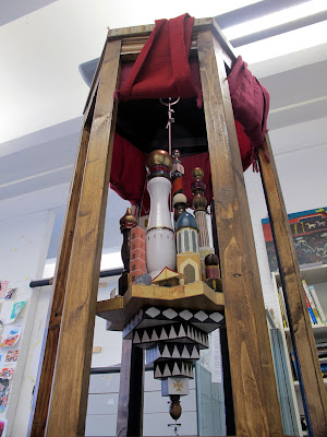
I spent the last post describing the intentions behind this piece I did for the minor project during my illustration degree's final year. I guess the last post was pretty vague as to what the piece actually looked like, but these next few images should settle that. 

I have no idea of what to call the thing I created - sculpture? installation? 3d illustration? monument? Whatever it turned out to be, I started work on it by sketching out a few ideas based on the images which I posted previously. I knew that I wanted it to have some kind of holy aura, to contain a secluded interior using curtains and to have this relic-like quality without it looking like a tourist souvenir. So I created this model out of cardboard and then proceeded to have a chat with my pap who suggested ideas of how best to build the structure without having it collapse during the project's hand-in. My father is one of those men who can build anything from anything and can single-handedly repair a house and while I'm not half as resourceful, I do owe much to him. 


During all of this time I had been hoarding bits of wood from the streets - scrap planks, abandoned bits of furniture in skips, knobs and balusters and banisters and anything that looked remotely like a dome or a tower, and much more. Earlier on I had made the decision to build this thing out of scrap wood, mostly out of pure necessity since I barely had any cash to pay the bills let alone buy wood to build a timeless relic. At the end I think that this worked in favour of the piece's final visual feel since I felt that the various different wooden elements accentuated the idea of drawing from different cultures to create a unified whole. The only money spent was on the varnishes, a couple of couch covers from a charity shop that my friend Lisa turned into curtains, a cheap TK Maxx candle holder and aluminium salad bowl for the dome and some other technical bits and pieces. Most of the construction took place at my uni's 3D workshop and later at home. 


 (model)


After construction came the decoration bit of the project. This involved varnishing, hand painting a quotation from Invisible Cities onto the structure, applying patterns to the floating city base and of course decorating all of the city's buildings. I based the quotation's typeface on what I thought might look like late-19th century British imperial lettering which I'd seen whilst working in museums in Malta (especially the Maritime Museum). The inverted star-shaped podium on which I built my floating city drew inspiration once again vaguely from the Middle East. The buildings of the city itself are representations of various global and imagined architectural styles - from Central European churches to Arabic minarets and so on. I tried as much as possible to maintain the geographical sequence of the Silk Route within the planning of my tiny city. The interior contains a sprinkling of exotic spices to evoke the smell of a market along the Silk Route and is illuminated by a light which I like to think of as being moonlight. 


This project was almost unlike anything I'd done before. It was a highly passion-driven venture of which I doubt I'd have the opportunity to repeat. I've recently had some ideas for it and I'll post any related plans on this blog (hopefully) in the future. Finally, here are some images of the final piece to finish off this post. Thanks for reading!


Thursday, September 1, 2011

Dream Out

Dream Out is a name lifted from Balam Acab's See Birds EP, one of my favourite EPs definitely my favourite EP from 2010. It's a beautiful track and here it is - 


I recently did some type-based works based loosely around the track's title. They're not influenced just by this track, but by lots of other slow-moving sounds and those crazy African textile patterns and the whole thing acted as a sort of exercise in current zeitgeist, so to speak. As always, I was meant to do much more of these.